Project 2
OpusFlow Mechanical Overview
Mobile Workflow Optimization · UX Redesign
Redesigned the OpusFlow mechanic overview to improve task clarity, reduce cognitive load, and support faster job completion in the field. The solution introduced a clearer information hierarchy, action-focused flows, and mobile-first ergonomics, helping technicians better understand progress, priorities, and next steps during installations.
Client:
OpusFLow
My Role:
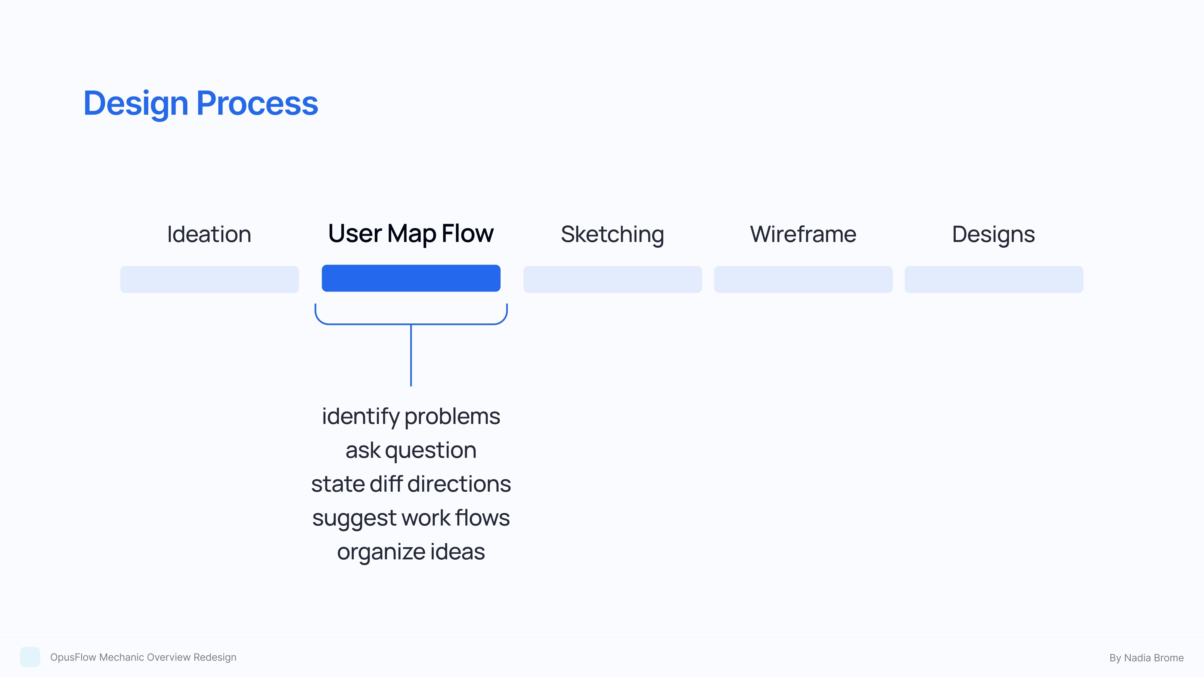
research, UX, concept ideation, UI


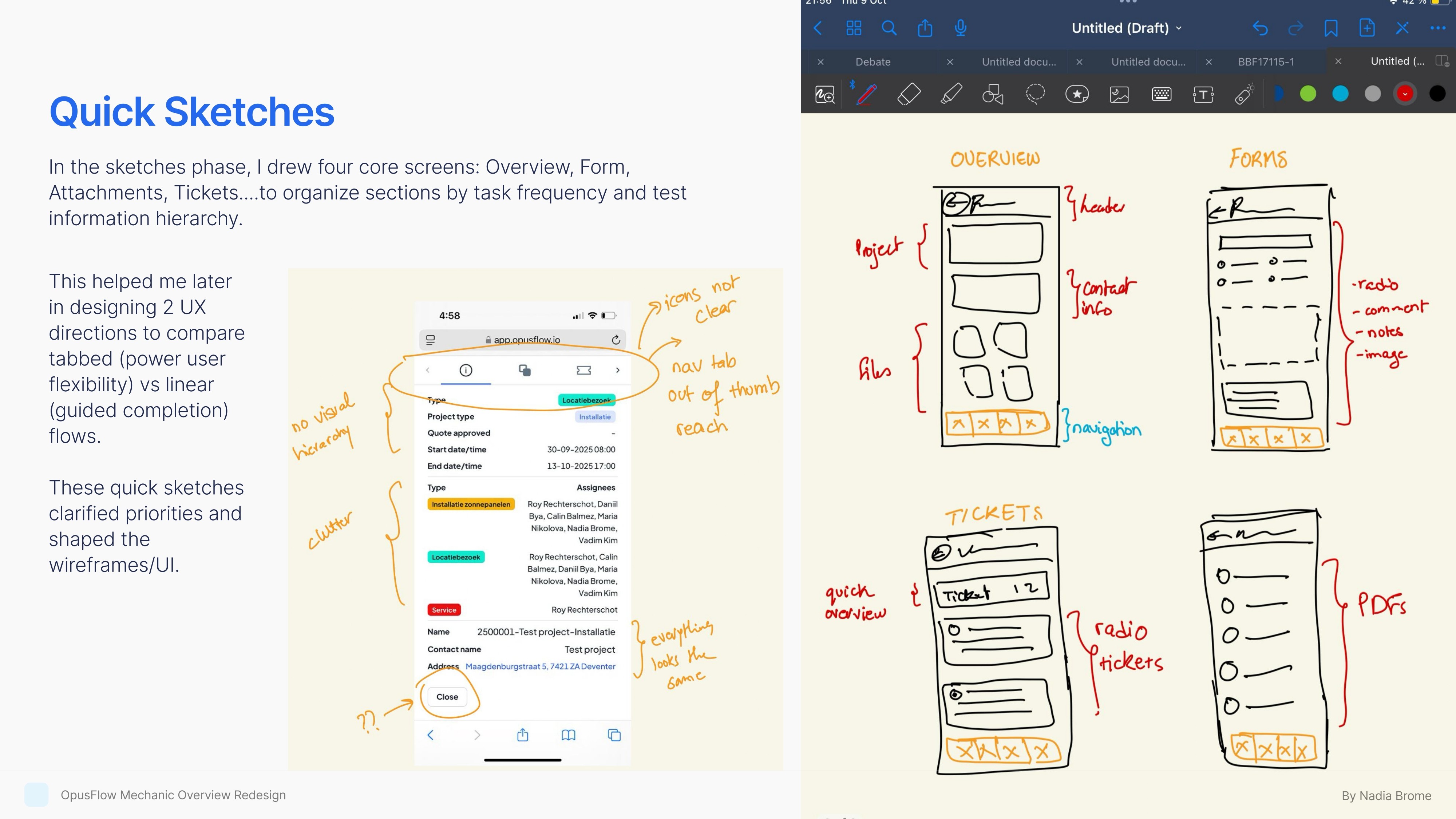
Flow 1: Linear Flow Solution
Improved the mechanic overview by turning it into a clear, linear flow with visible progress, so mechanics always know what's next.
Grouped fields into logical sections, and used consistent chips for Status/Phase/Priority to cut scanning time. A sticky progress bar and Forms shortcut reduced taps, while separating Tickets and Forms would improv follow-up.
Overall, updates take fewer steps, errors drop.


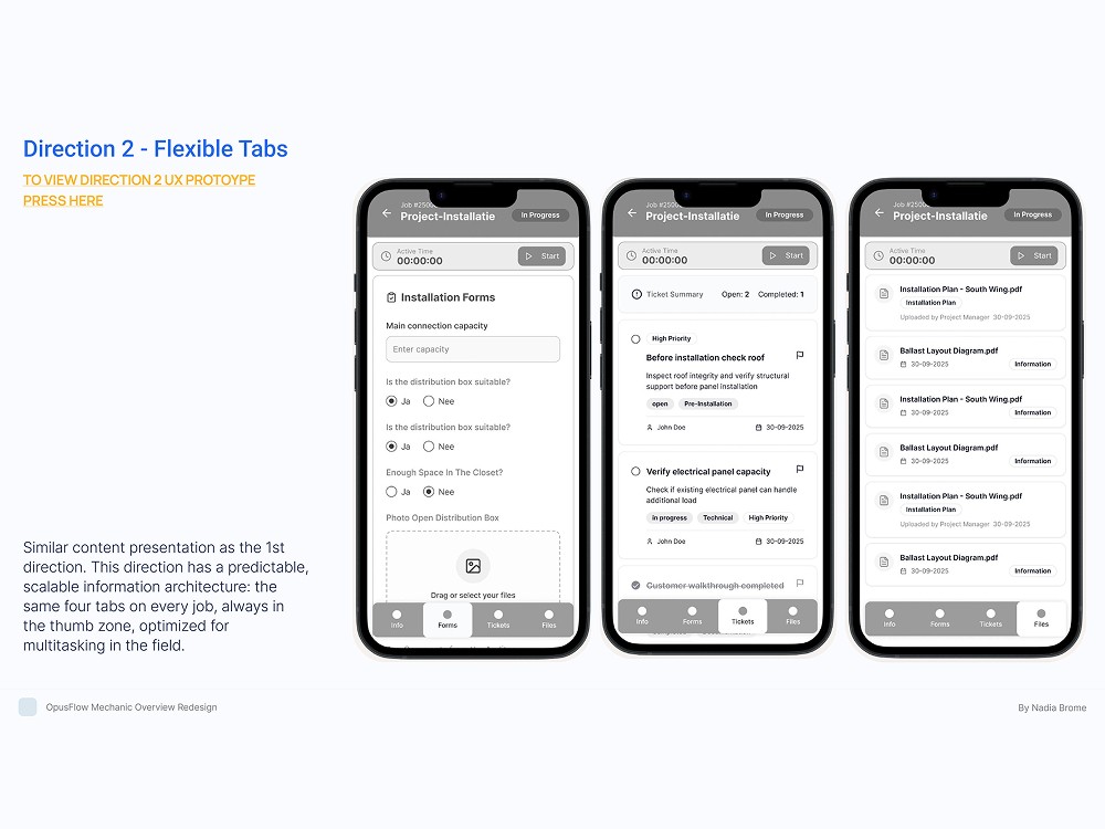
Flow 2: Fixed Tabs Solution
This direction uses a fixed bottom tab bar: Info, Forms, Tickets, Files so mechanics can jump between the four core areas with one thumb and without losing place.
The job header (ID, title, status) and active timer stay persistent for context, while collapsible sections keep the Info view scannable. Tabs preserve in progress state which cuts navigation time and errors compared to deep menus.