Project 3

Intranet for Blom Invest

Intranet for Blom Invest

Bank Intranet UX/UI Design

Bank Intranet UX/UI Design

This project was done during my time at Born Interactive for BlomInvest Bank.


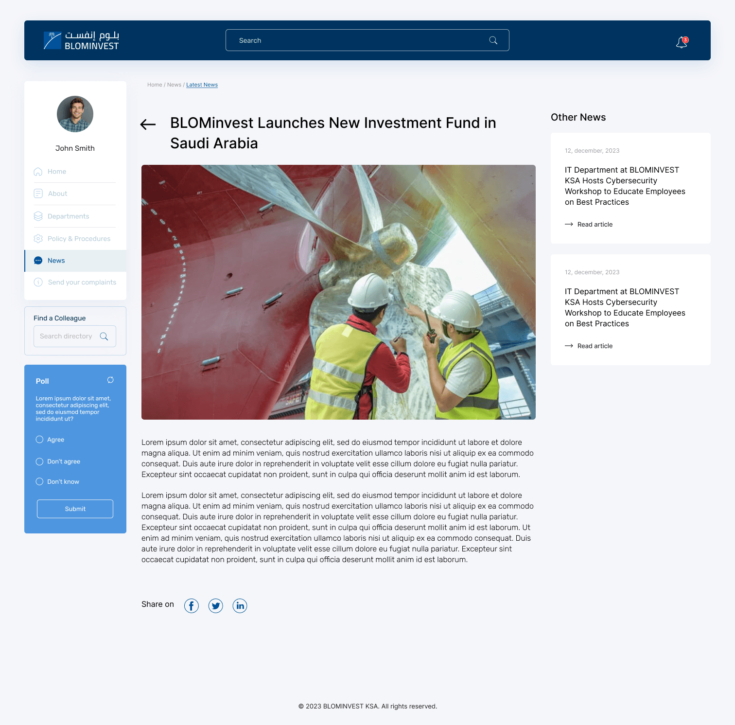
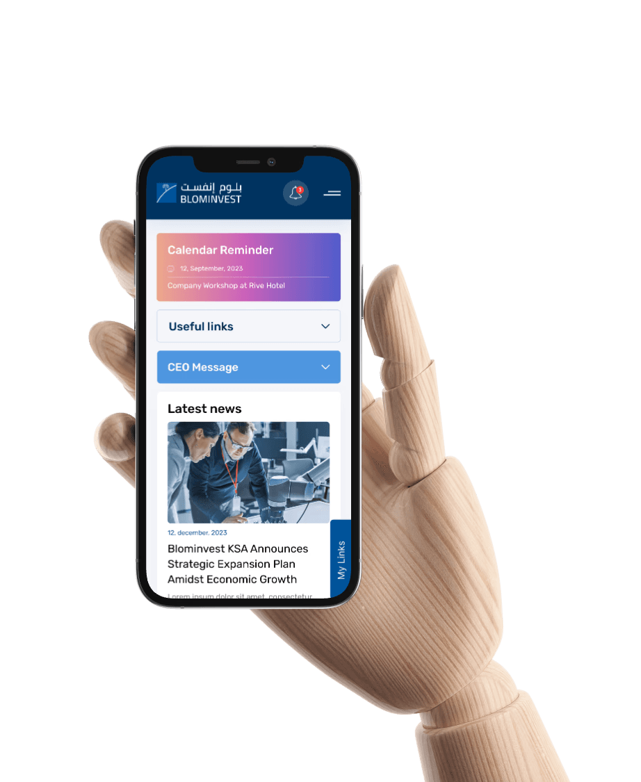
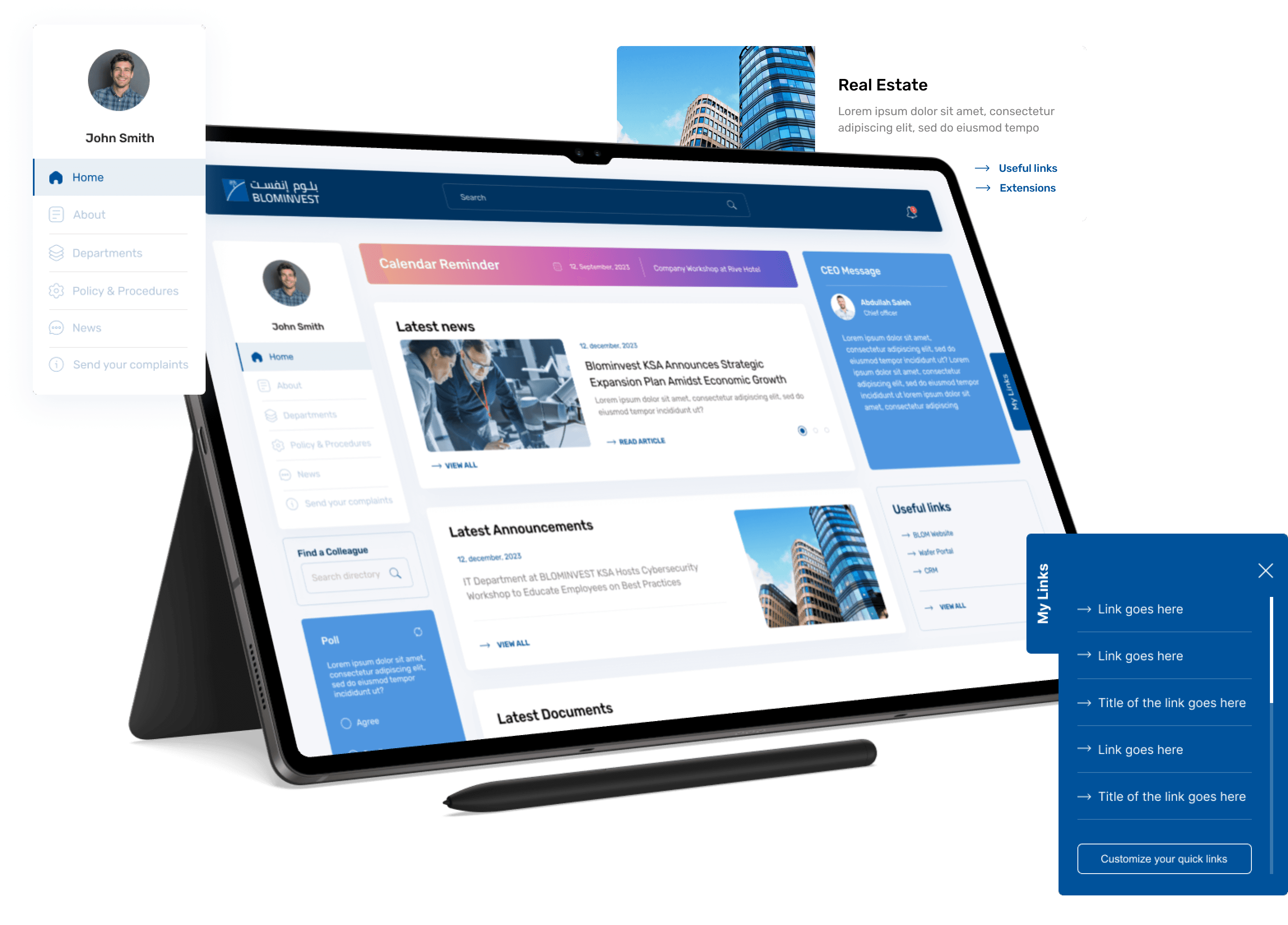
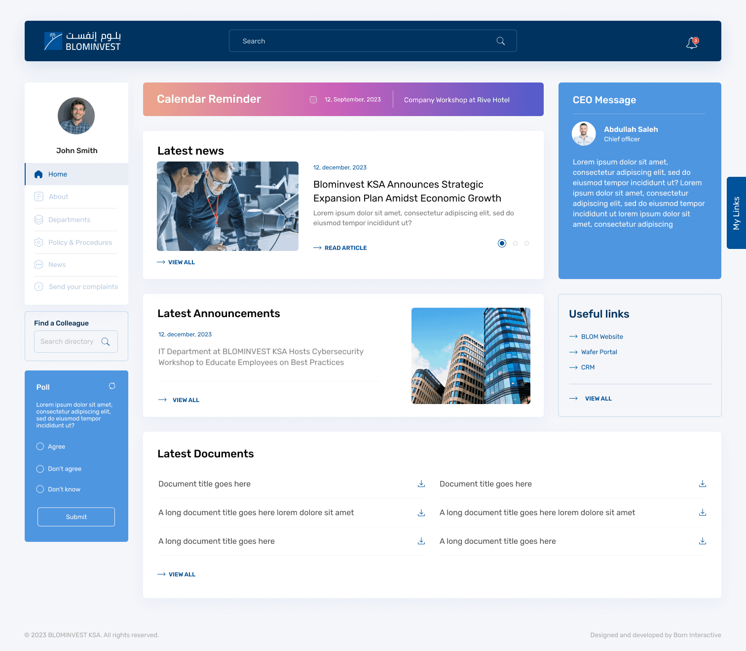
The goal was to design a modern, user-friendly intranet platform for internal use by BLOM Invest employees. The platform needed to centralize news, announcements, performance updates, asset and fund management data, and internal resources, improving communication, efficiency, and access to business-critical information.

Client:

Bank Blom Invest @ Born Interactive

My Role:

research, concept ideation, design

Challenge

At BLOM Invest Bank, I led the design of a new intranet platform to transform how employees across departments access information, track fund performance, and interact with internal operations.

  • Outdated internal communication tools scattered across emails and shared drives

  • Poor information discoverability

  • Lack of visual hierarchy and brand consistency

  • No central place to track fund performance, KPIs, or department-level news

Discovery & Research

Stakeholder Interviews
I conducted 5 structured interviews with department heads (HR, Compliance, Asset Management, IT, and Communications) to understand each team’s goals and internal communication challenges.

Main goals identified:

  • Reduce time spent locating key documents

  • Push critical updates to the right employees fast

  • Create transparency across departments

  • Track fund performance at a glance

User Interviews & Surveys
I surveyed 15 employees (from admin to fund analysts) to learn how they currently accessed internal info.

Key insights:

  • “I waste 20+ mins daily searching for docs or updates.”

  • “No single place to see fund KPIs.”

  • “Mobile experience is unusable.”

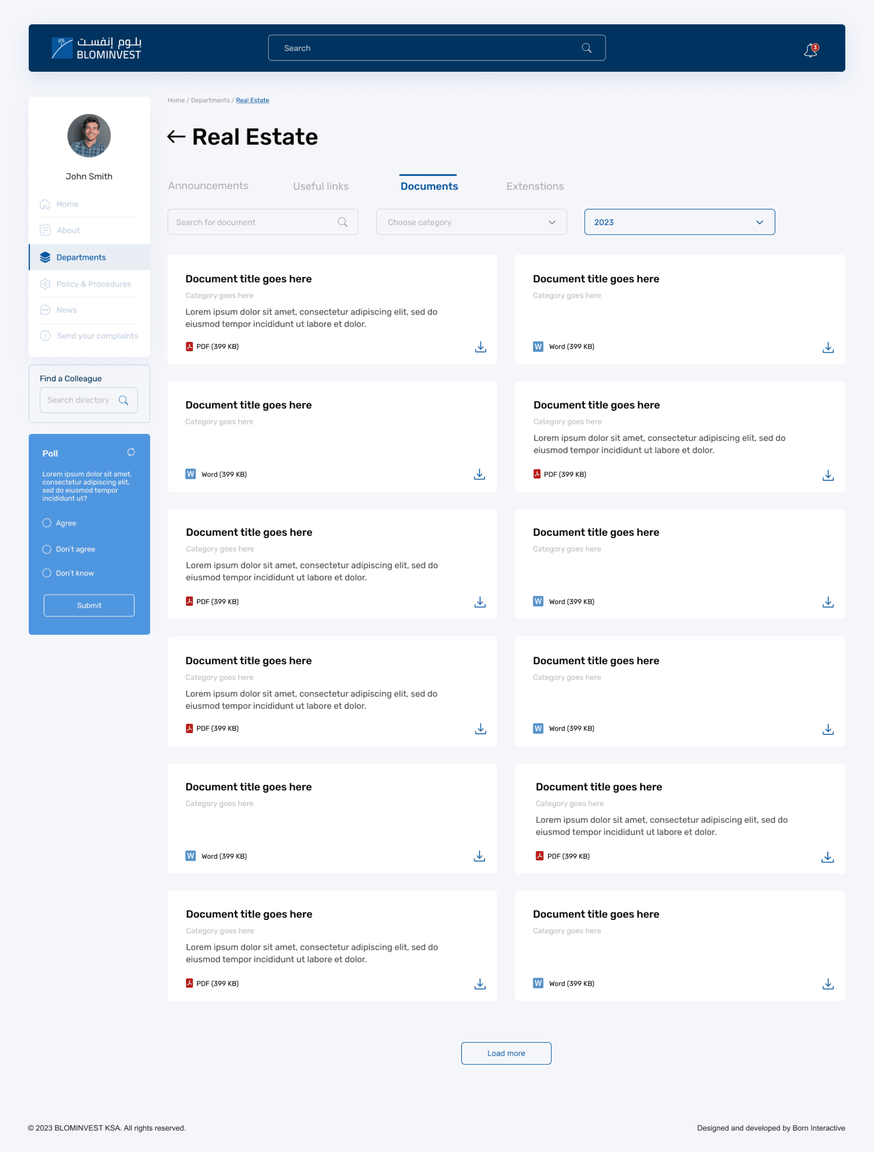
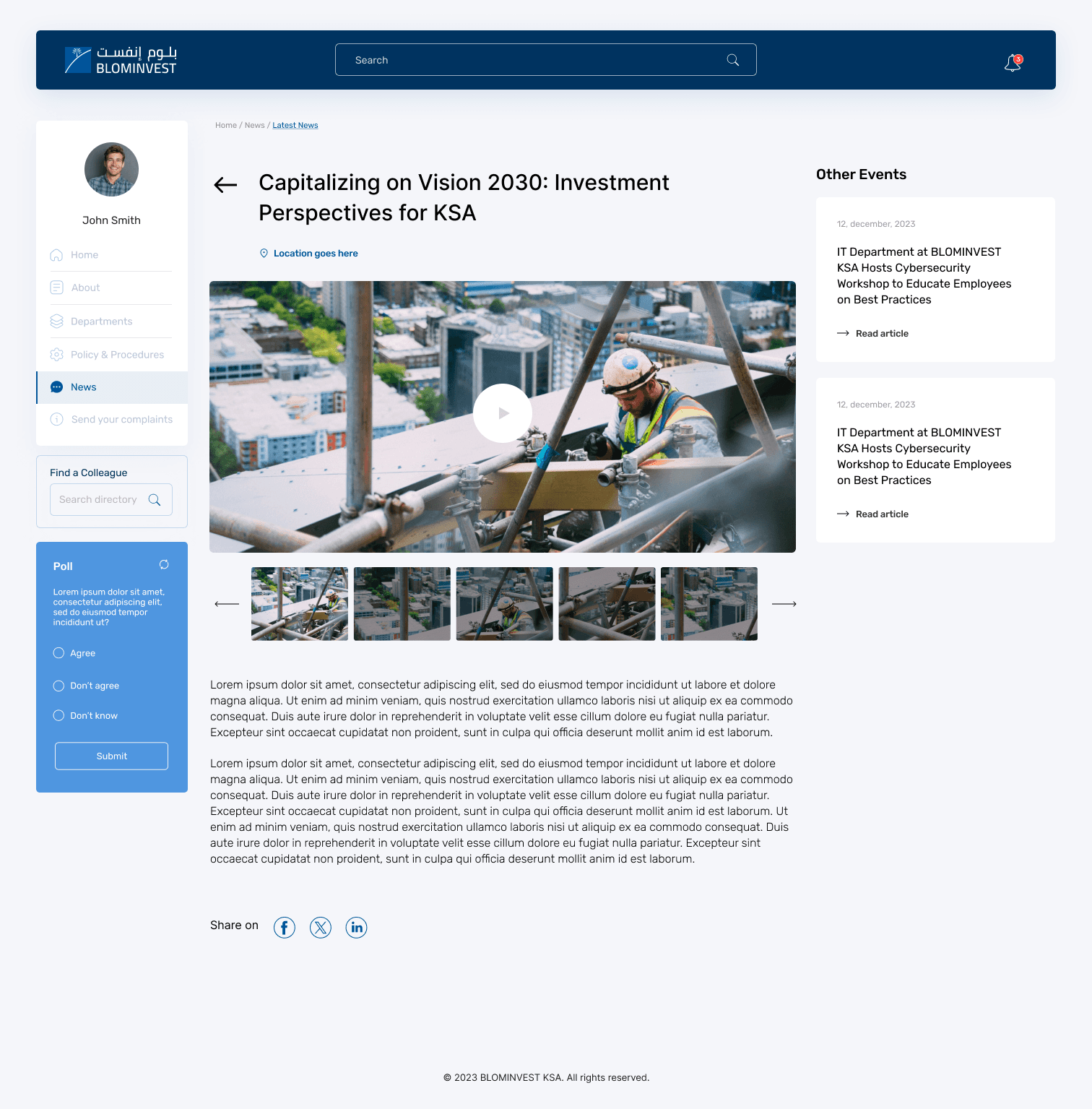
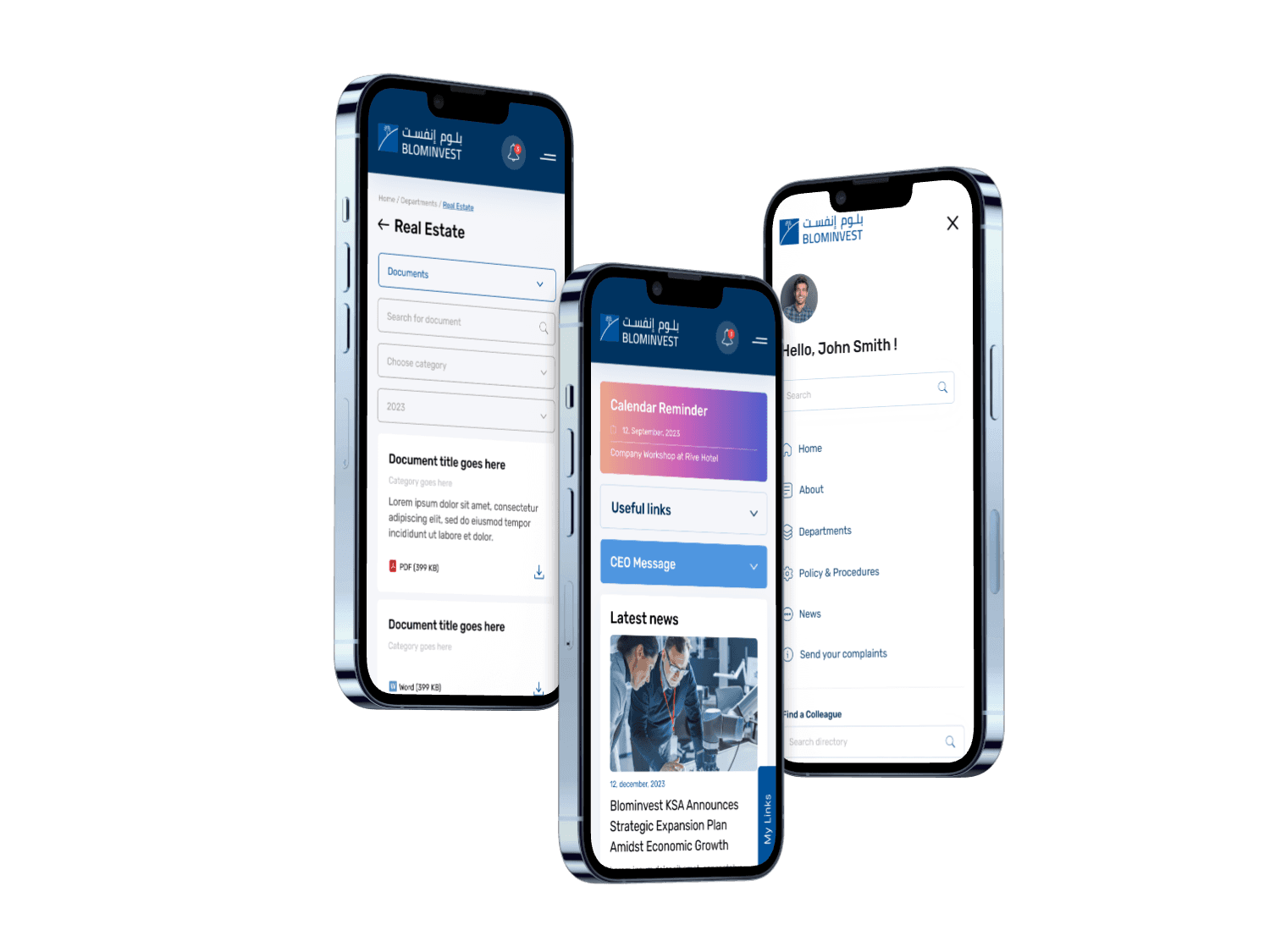
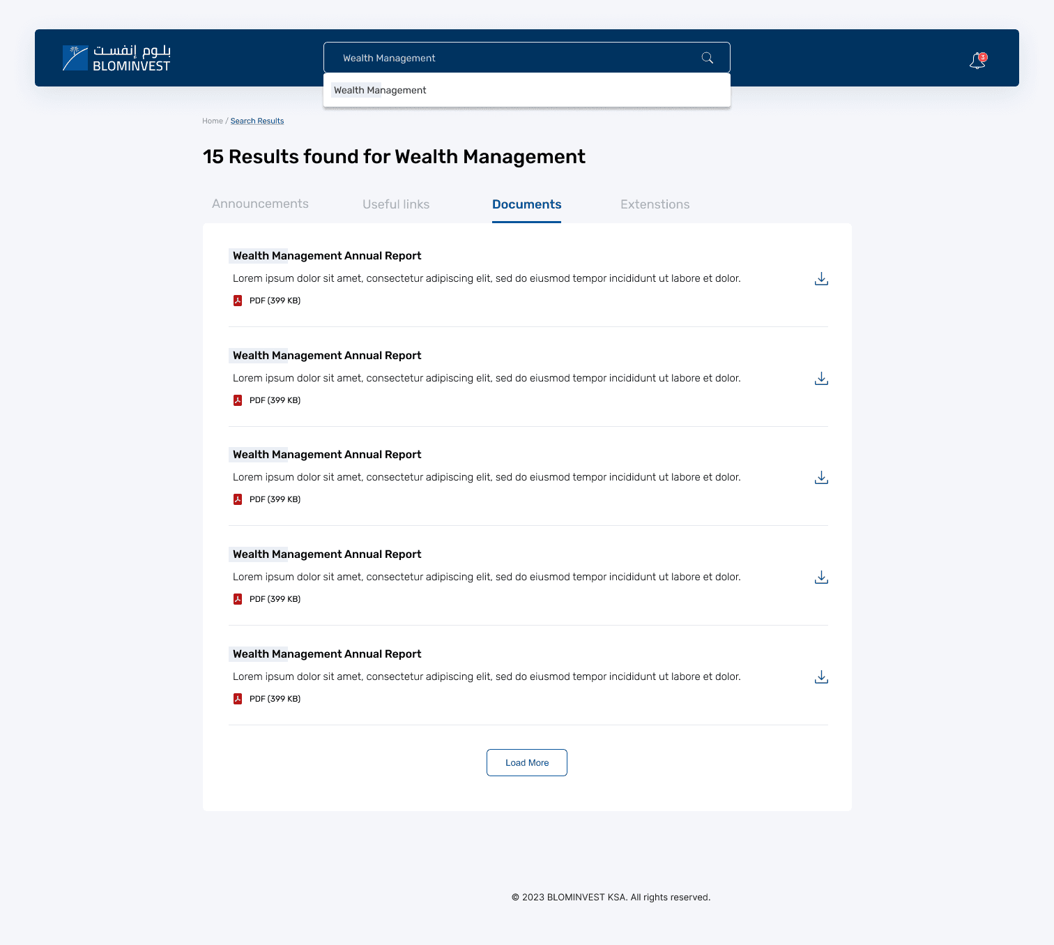
Information Architecture to Layout

From the UX work:

I created a modular grid-based layout, matching how users prioritized content: updates, funds, documents

Top navigation used predictable labels derived from card sorting sessions (e.g., “Fund Tools” vs “Asset Center”)

Components were reusable and scalable, aligned with roles and task frequency


The UI wasn’t a layer of decoration—it was the output of a user-first process. Every layout, color, and interaction reflected how BLOM Invest employees worked, thought, and moved through their tasks. The result: a visually cohesive, behaviorally intuitive system built to enhance internal efficiency.

Sustainability Thinking

Beyond environmental impact, the interface was designed for long-term maintainability and scalability.


  • Helped cut internal printing needs by 70%

  • Designed energy-efficient UI and introduced a digital-only document hub

  • Emphasized mental sustainability via clean layouts and information clarity

I built a reusable design system in Figma that allowed developers to implement consistent, low-maintenance components—reducing future tech debt and design rework. Each UI element was structured to be future-proof: flexible enough to accommodate evolving workflows without requiring a full redesign. This systems-based approach supports a more sustainable internal ecosystem—where design decisions can scale, adapt, and minimize waste over time.

NB.

NADIA BROME — PRODUCT DESIGNER / ARCHITECT —

nadiabrome@hotmail.com

+31 6 30 19 33 50

Amsterdam, Netherlands

© 2025 / All rights reserved

NB.

nadiabrome@hotmail.com

+31 6 30 19 33 50

Amsterdam, Netherlands

© 2024 / All rights reserved

NB.

nadiabrome@hotmail.com

+31 6 30 19 33 50

Amsterdam, Netherlands

© 2024 / All rights reserved